Tag: Python

  • The Extra Cost in Dollar Cost Average Investing?

    The Extra Cost in Dollar Cost Average Investing?

    With some spare cash in my current account, I’ve started exploring investing in individual stocks and ETFs more seriously. To begin putting your money into these investments, most investors would have already heard of the lump-sum investing and dollar-cost averaging (DCA) strategies.

    What are they?

    As their names suggest, lump-sum investing simply means investing all your money into an asset at the same time, while DCA means investing smaller amounts of money at regular intervals, over a period of time.

    There are pros and cons to each approach, with a key difference being risk management. According to this Fidelity article:

    [DCA] potentially [helps] reduce the impact of volatility on the overall [asset] purchase. This can serve as a risk management trading strategy if you end up buying more when the price is relatively lower and buying less when the price is relatively higher.

    As I’m uninterested in timing the market (i.e. trying to outsmart other investors by speculating when to buy low and sell high — which in this case would make lump-sum investing a good strategy), DCA sounded like a great strategy as I minimise my transaction risks while I get exposure to the stock markets.

    Andrei Jikh (who’s currently my favourite finance Youtuber) talked about investing US$100 πŸ‘πŸΌeveryπŸ‘πŸΌdayπŸ‘πŸΌ into the VTI and SCHD ETFs here.

    But what’s the catch?

    DCA has a big drawback, especially for retail investors who are looking to invest small amounts of money in regular intervals.

    You could be better off accumulating your money into bigger amounts before investing in longer intervals, e.g. investing $2000 every 2 months, instead of investing $1000 every month. If lump-sum investing and DCA are two ends of a spectrum, the optimal spot for a (risk-averse) investor is at neither ends, and where on the spectrum depends on your own risk appetite. DCA is not a catch-all for the risk-averse because of πŸ’²transaction costsπŸ’².

    When transaction costs come into play

    Depending on the broker you’re transacting your assets through, they have various kinds of fee models. For simplicity, I’m expressing transaction costs as a proportion of the monthly investment amount, so there is no need to consider fees separately (e.g. buying fees, management fees, currency conversion…).

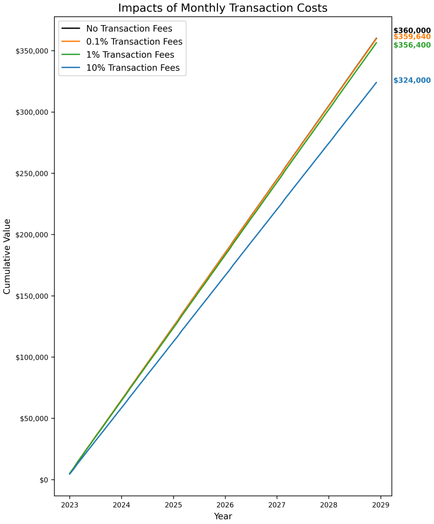
    To visualise the impact of transaction costs, we’ll compare how a portfolio with no cost differs from those with costs. The graph below shows 4 portfolios:

    • Portfolio 1 (in black): The investor invests $5000 every month with no monthly transaction costs. Zero transactional cost will never hold true in reality, so this portfolio is just a hypothetical benchmark.
    • Portfolio 2 (in orange): The investor invests $5000 every month, but with 0.1% of investment value as transaction cost, which works out to be $5 every month.
    • Portfolio 3 (in green): $5000 investment every month, 1% transaction cost, which works out at $50 every month.
    • Portfolio 4 (in blue): $ 5000 investment every month, 10% transaction cost, which works out at $500 every month.
    Difference between portfolios is the percentage-point difference in transaction costs

    By the end of 6 years, Portfolio 1 (with no cost) ended at $360,000, Portfolio 2 (0.1% cost) ended at $359,960, Portfolio 3 (1% cost) ended at $356,400 and Portfolio 4 (10% cost) ended at $324,000.

    In percentages, Portfolio 2 has performed 0.1% worse than Portfolio 1, Portfolio 3 has performed 1% worse than Portfolio 1, and Portfolio 4 has performed 10% worse than Portfolio 1. (Perhaps) Surprisingly, the differences in portfolio performance are the same as the percentage-point differences between the transaction costs.

    In other words, your DCA strategy will perform x% worse than the best hypothetical DCA strategy, and x% is your transaction cost as a percentage of your investment amount at each interval.

    What if I include a principal and projected returns?

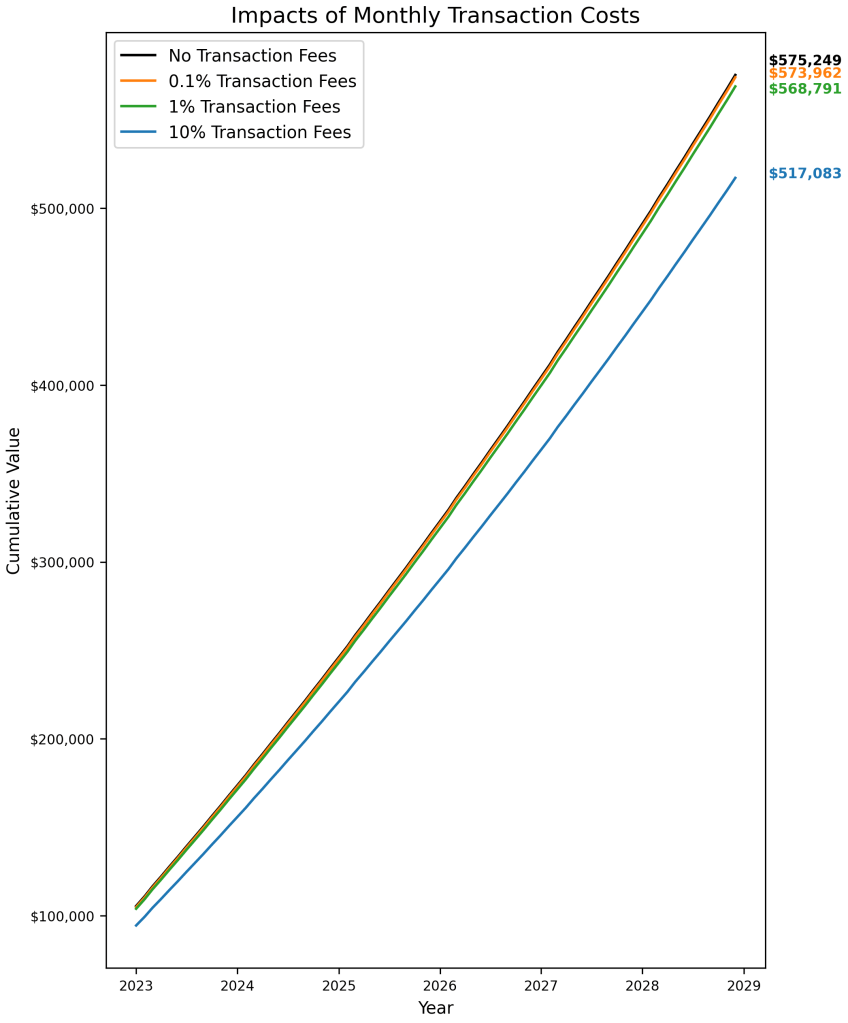
    The previous example assumed $0 initial investment and 0% growth in the money invested. The next graph shows the same portfolios, but with an initial $100,000 investment (also subjected to investment costs), and 6% annual growth in money invested.

    Difference between portfolios is still just the percentage-point differences in transaction costs

    The conclusion stays the same, where the differences in performance is simply the percentage-point differences between the transaction costs of the portfolios.

    Pay attention to your transaction costs

    Given that the key differentiator between DCA strategies is how low we can push the transaction costs as a percentage of the investment amount, it’s crucial to get the correct view of transaction costs each time we make a purchase.

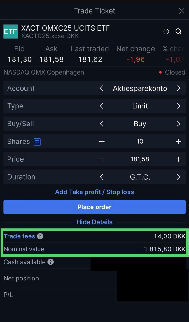
    I can’t speak for all brokerage apps, but this is what I see when I try to buy an ETF through my bank:

    Transaction costs at first glance

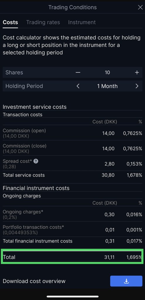
    While it’s tempting to simply calculate my transaction cost here as 14/1815.8 * 100% = 0.771%, a more realistic amount is in fact 1.695%, and arriving at this number involved a few more clicks in the app.

    Transaction costs at second glance

    Another important implication of miscalculating your transaction cost is having a cost-to-investment ratio so high that the investment takes a long time to hit breakeven.

    In a nutshell

    Always consider your transaction cost as a percentage of your total transaction amount at each DCA interval.

    If we consider purely in absolute amounts, while a transaction cost of $5000 might raise alarm bells, we might start thinking that a transaction cost of $10 is acceptable or even cheap. This is not entirely true.

    If a stock costs $100 while you have to pay $10 in transactional cost, this translates to 10% of the investment amount. Consistently paying 10% in transaction costs means losing out substantially to other DCA strategies (which becomes a hefty amount when more money is involved) and the investment having to make 10% before turning a profit.

  • What Is Factor Investing?

    What Is Factor Investing?

    I’ve recently taken a class in CBS on factor investment strategies and I thought it’d be really cool to share some of the results I found while writing a paper. 😎

    I’ve always been interested in investing but I’ve never been a fan of buying stocks (or other investment vehicles) by word of mouth, because they’re trendy or simply based on gut-feel. I’d prefer to do my due diligence: conduct some form of independent research and ascertain the vehicle’s value before buying it.

    But alas, I have zero background in corporate finance, nor do I know how to conduct deep-dives into financial statements, and I don’t have time to regularly pore through companies’ annual reports before deciding what stocks or bonds I’d like to buy.

    So this is where I think factor investing offers a nifty solution.

    Factor Investing

    Very simply put, factor investing involves choosing securities (or just stocks) based on characteristics that are associated with higher returns. Common characteristics include size (buy small stocks), value (buy cheap stocks) and quality (buy good quality stocks).

    What???

    To illustrate, buying stocks based on the size characteristic simply involves calculating the market capitalisation of all companies in the market, then buying the stocks of say, the bottom 30% of companies based on this metric.

    On the other hand, buying stocks based on the quality characteristic could involve calculating the return on assets of all companies in the market, then buying the stocks of the top 30% of companies based on this metric.

    That’s it?

    There is in fact a multitude of characteristics and ways to proxy for these characteristics (briefly discussed here), but they are beyond the scope of this article.

    And how is this a “solution”?

    Choosing stocks based on their characteristics,

    1. satiates my need to conduct fundamental/ quantitative (albeit hasty) research before buying anything, and said research
    2. can be implemented easily over a large number of stocks, which
    3. implies that if I do execute my factor investment strategies, my portfolio is diversified.

    So how well do factor investment strategies perform?

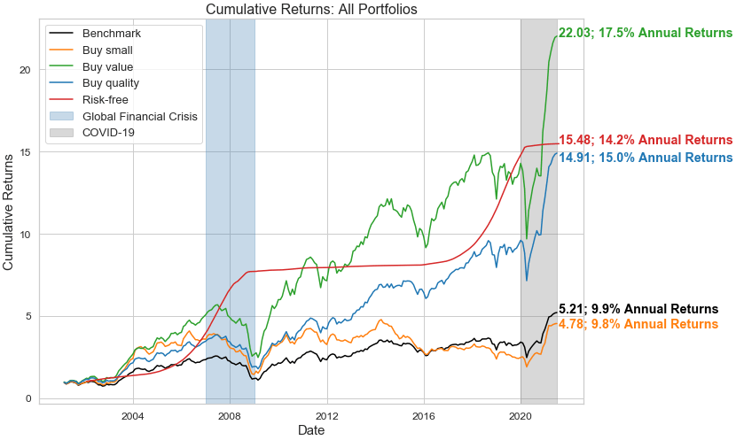
    I’ve chosen to create portfolios of stocks based on the value, quality and size characteristics, and here’s a quick plot of their cumulative returns:

    Cumulative and annualised returns of all portfolios

    The graph above indicates that if you’ve invested $1 into the portfolios built from the value and quality characteristics in 2001, the $1 would have turned into $22.03 and $14.91 respectively in June 2021 🀩. These translate into annual returns of roughly 17.5% and 15.0% respectively. 🀩🀩

    The outcomes would have been markedly different if you had invested $1 into the benchmark portfolio, which is a naive strategy of simply buying every single stock there is in the market, or the portfolio built from the size characteristic.

    All portfolios seem to even be COVID-proof. 😱

    Dataset, the nitty-gritty, and some caveats

    Now that I’ve hopefully gotten your attention, these numbers come with several important notes.

    Dataset

    Related to the dataset:

    1. the graph above is derived from US stocks from January 2001 to June 2021,
    2. the stocks comprise of 15,823 companies that are both still active or have gone inactive, averaging 94 months of available data, and
    3. the dataset is obtained from the Wharton Research Data Services/ Compustat,

    while some important notes concerning my data processing steps are my choices to:

    1. limit return rates to the 99th-percentile return rates of all companies in each month, because some companies report extremely high (and unlikely) monthly returns on certain months and these high values distort my portfolio performances quite significantly,
    2. remove financial firms from the pool of these stocks, and
    3. keep micro-cap stocks in this pool of stocks even though they might introduce complexities such as poor fundamental data quality, with some literature also claiming that they bore little economic relevance.

    Building the portfolios

    Beginning with the simplest, the benchmark portfolio was constructed simply through buying all stocks available in the dataset. Companies can come and go throughout the 20-year horizon, so the basket of stocks that make up the benchmark portfolio can in fact comprise of different stocks month-on-month, over the years.

    The portfolio based on buying small stocks is built by:

    1. computing the market capitalisation for every company on a monthly basis,
    2. ranking all companies by their market capitalisation values, and
    3. buying the bottom 30% companies based on this metric.

    As the market capitalisation is calculated every month, the stocks that make up this “small-stocks” portfolio can therefore also change month-on-month.

    The portfolios based on buying value and quality stocks follow a similar logic, except value stocks involve buying top 30% companies by book-to-market ratios, and quality stocks involve buying top 30% companies by return on assets.

    Are the returns in fact any good?

    If it was so easy to construct these portfolios, where I simply have to buy stocks based on some easily calculated metrics, what’s stopping every other investor from doing the same and then eventually arbitraging away any excess returns that might be associated with these characteristics?

    Indeed, there are loads of literature debating if the size characteristic/ factor still remains, while many assert value and quality’s presence. Regardless, I compare all portfolios to the U.S. 4-week T-Bill rates — where the T-Bill is a relatively risk-free asset — to test if my actively managed portfolios are able to outperform an asset that requires relatively less investor involvement and entails lower risks.

    Cumulative and annualised returns of all portfolios, with risk-free asset

    As the line in red suggests, consistently investing in the T-Bill could yield similar to much better returns than just simple factor investing.

    In sum

    I’ve barely scratched the surface of factor investing, and there are in fact countless other nuances that could be considered. On top of various other characteristics/ factors, there are different ways to proxy for these characteristics, different ways of weighing the returns of each stock in every portfolio, and even the possibility of combining short-selling and going long on stocks, instead of the long-only portfolios that I have described.

    Nonetheless, I think this exercise was a pretty good prelude either to fundamental analysis, to fancier combinations of factor investing, or simply a reassurance that sometimes risk-free assets are the way to go for the uninitiated. πŸ˜…

  • Sentiment Analysis on Singaporean Twitter’s  Reactions related to COVID-19

    Sentiment Analysis on Singaporean Twitter’s Reactions related to COVID-19

    I recently became acquainted with the BSI Sentiment Analysis Pipeline created at BSI Bocconi (thanks Mathilde! πŸ˜‰) and having failed before at scraping Twitter’s data, I decided to give this tool a shot. It turned out to be a gift that kept on giving.

    My initial idea was simply to download tweets from Twitter and store these tweets in a structured, tabular form. While it sounds straightforward, many tools currently are either outdated and do not work, require a Twitter developer account or necessitate other cumbersome steps. The BSI Sentiment Python library works after these 2 lines (in Anaconda Jupyter NB):

    !pip install bsi-sentiment --upgrade
    
    from bsi_sentiment.twitter import search_tweets_sn
    

    Their GitHub page shows an example of downloading tweets from Twitter, which I’ve modified into the following for a Singaporean context:

    tweets = search_tweets_sn(
      q="singapore",
      since="2020-01-01",
      until="2020-12-31",
      near="Singapore",
      radius="200km",
      lang="en",
      max_tweets=-1
    )
    
    tweets.get_sentiment(method="vader")
    tweets.to_csv("./results.csv")
    

    Following this chunk of codes, tweets made from (presumably public accounts) within 200km radius of Singapore, in year 2020, containing the word “singapore”, are downloaded and stored in a .csv file named “results” in my local drive. Not only that, any keen eye would have spotted the get_sentiment() method. This allowed me to also obtain a “sentiment score” for every downloaded tweet! Exciting! 🀩

    Sentiment Analysis

    In a brief two-liner, sentiment analysis in this context is simply assigning a score to a tweet based on its content. Depending on the score assigned, the sentiment of the tweet is then assessed on a range of negative (<=-0.05) to neutral (-0.05 to 0.05) to positive (>=0.05). The scoring algorithm is based on VADER, “a lexicon and rule-based sentiment analysis tool that isΒ specifically attuned to sentiments expressed in social media“. More details available here.

    Chinese New Year Tweets

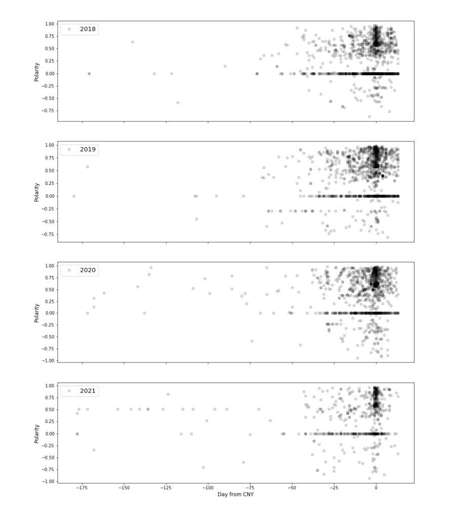
    Since I’m now able to easily obtain sentiment scores to every tweet that I’ve downloaded, it quickly occurred to me to try comparing sentiments surrounding CNY over the years, and especially in 2020 and 2021 as CNY 2020 in Singapore happened when the COVID-19 pandemic was first picking up, while CNY 2021 happened with some restrictions imposed by the Singaporean government. Here’s some visualisation:

    Sentiments surrounding CNY, 6 months before and 14 days after

    Each dot represents a tweet, a dot with “polarity” below or equals -0.05 is interpreted as a negative tweet, between -0.05 to 0.05 as a neutral tweet and above or equal to 0.05 as a positive tweet. High intensity in colour is due to the dots overlapping, indicating high tweet frequency during that time.

    It’s quickly apparent that tweets about CNY are generally made about a month before CNY, peaking in frequency around CNY itself (when “Day from CNY” = 0) and are generally neutral to positive, seemingly regardless of the COVID-19 pandemic. The spread in polarity seems similar across all years. There are notably fewer positive tweets in 2021 (indicated by the lower intensity in colour) but it’s probably attributable to lower tweet counts in general and not a shift from positive to neutral or negative sentiments.

    Circuit Breaker

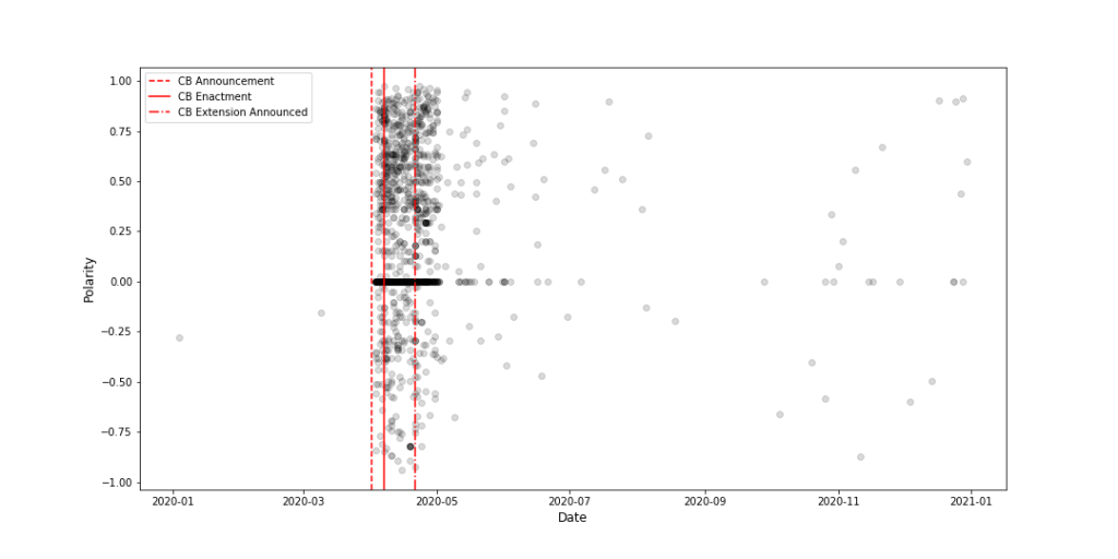
    I wanted to investigate the scoring methodology a little further so I decided to see what people were saying about the circuit breaker measure Singapore had implemented back in April 2020.

    Sentiments surrounding circuit breaker

    In brief, strict restrictions (termed collectively as the circuit breaker (CB)) were announced on 3rd April (first red line), enacted on 7th April (second red line) and announced to extend on 21st April (third red line).

    Expectedly, many tweets containing the terms “circuit breaker” started to show up after the first CB announcement and lasted until some time after the announcement of its extension. What was curious to me however, was the high amount of positive tweets relative to negative ones regarding the CB, even after its extension. I did not expect Singaporeans to tweet favourably about such a measure, and even less so after it got extended.

    Perhaps the VADER model doesn’t understand the Singaporean context?

    As the positive sentiments didn’t make immediate sense to me, I created a word cloud to explore some of the most common words in these CB-related tweets.

    Common words in CB-related tweets

    The size of each word represents the frequency of it appearing in the CB-related tweets. This word cloud seems to lend a bit more credence to the positive sentiments picked up earlier, with frequent words including, “love”, “thank”, “good” and “happy”. There is nothing jarringly negative except perhaps “lockdown”, though I’m not entirely sure how the VADER model would rate this word.

    In sum

    I got disproportionately excited about the BSI Sentiment Python library, one idea led to another and culminated in this very insightful exercise. Kudos to the BSI Bocconi team for putting this library together and I hope it remains functional for a long time to come! Please also feel free to comment if you spot any mistakes or have other interesting views to share. (Apparently it also pays to be a busybody on LinkedIn — please keep sharing or liking useful tools on there! πŸ˜‰)

  • How To Learn Python Effectively

    How To Learn Python Effectively

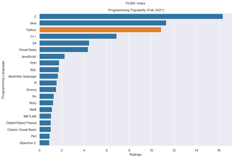
    Python is third in programming language popularity and people are (literally) buying in.

    TIOBE data from tiobeindexpy; visualisation codes from here

    On the data science front, Coursera’s lists of Top 10 Courses in 2020 and 2019 include:

    1. Machine Learning by Stanford University
    2. Programming for Everybody by University of Michigan
    3. AI For Everyone by DeepLearning.AI
    4. Algorithms by Princeton University
    5. What is Data Science by IBM, and the list goes on…

    I get it — data science, analytics, machine learning, AI… they all sound really kewl, trendy 😎 and because they’re so heavily thrown around as buzzwords, we become curious and want a slice of the analytics pie. People around me have spoken about picking up Python, Tableau, SQL… and if you find yourself on the brink of “jumping onto the Python bandwagon” or wanting to give programming a shot, here’s a good way to get started with analytics.

    Start with well–received course materials

    A natural first step to begin learning anything is to sign up for a Coursera or an edX course. This is easy — you can either get acquainted with this free MIT open courseware on the Introduction to Computer Science and Programming or sign yourself up on Coursera for a well-reviewed course. I audited (the famous) CS1010S during my time in NUS.

    While this is a great start, it gets increasingly difficult to follow through because your initial curiosity that prompted you to sign up for the course quickly gets extinguished by the rigour of the course content. You might find yourself zoning out, procrastinating and ultimately failing to complete the course. This happened to me when I attempted a financial engineering course on Coursera, and it brings me to the importance of a parallel point.

    Envision an easy and appreciable purpose

    Setting a goal for yourself to achieve using Python or another analytics tool is imperative and a good way to keep you focused and motivated as you’ll be aware of your own learning outcomes. In fact, with one, or even a series of clear, achievable purpose(s), you will realise that the course content does not immediately help you achieve your purposes, and you will have to google the rest. But what you find on Google is now a lot more understandable as you’ve progressed through your course materials, and you end up mastering more than what you had signed up for. Here’s what I mean:

    Deciding a purpose

    Your goal or purpose could be something as ambitious as applying text analytics on your personal credit card statements, generating stereograms, or just for starters, to simply generate the TIOBE index chart above. While it sounds innocuous and straightforward, here’s the source code to generate it:

    !pip install tiobeindexpy
    
    from tiobeindexpy import tiobeindexpy as tbpy
    import seaborn as sns
    import matplotlib.pyplot as plt
    
    sns.set(style = "whitegrid")
    sns.set(rc={'figure.figsize':(11.7,8.27)})
    
    top_20 = tbpy.top_20()
    top_20['Ratings'] = \
    top_20.loc[:,'Ratings'].apply(lambda x: float(x.strip("%")))
    top_20['Change.1'] = \
    top_20.loc[:,'Change.1'].apply(lambda x: float(x.strip("%")))
    
    labels = top_20['Programming Language']
    values = top_20['Ratings']
    rank = top_20['Feb 2021']
    
    clrs = \
    ['tab:orange' if (x == 3) else 'tab:blue' for x in rank]
    sns.barplot(x=values, y=labels, palette=clrs)\
    .set_title('TIOBE Index \n\n Programming Popularity (Feb 2021)')
    
    plt.savefig('Programming Popularity.png', bbox_inches = 'tight')
    

    Evidently, this “simple” purpose of generating a bar chart in fact necessitates your mastery of Python’s syntax, data types, understanding how to import packages, manipulate dataframes, use anonymous functions and list comprehension. This is no mean feat, but precisely because you have a purpose/ end-goal in mind where you can visualise a working example to apply these concepts, hearing or learning about them as you progress through your course should feel more exciting and less abstract.

    You’ll also realise that while your course might cover content at the conceptual level, you’ll have to google how to change the colour for a specific bar in your bar chart, how to use 2 lines for your chart header or how to change the font size of your chart labels. In this manner, your purpose will prompt you to search beyond course materials and you’ll end up learning more.

    In sum

    While it might be tempting to jump on the bandwagon for a programming trend that comes along, it’s more important to ask yourself first if you’re fundamentally interested and if there’s any real use for what you’re jumping onto. If you are and there is, then identify one or a few purposes and work towards them while you complete your course material.